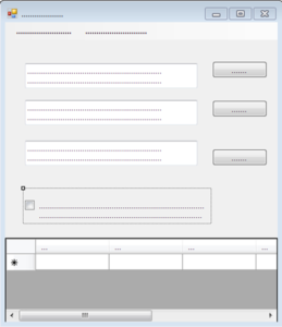
And communication contains technical terminology. Here is a simple way of showing this.
 A UX designer who gets not only the user focus, but who also knows the critical role of language is my former colleague, Windows UX designer and now principal of UX Design Edge, Everett McKay. I borrowed the title of this posting from his presentation which later became a book: UI is Communication.
Obviously not everything on the user interface is language or terminology-related. And with the increased use of touch, voice or motion interaction, we might see an even clearer focus of certain types of software on these other ways of communication.
But a simple screen shot without words can demonstrate that certain types of user interfaces rely heavily, if not exclusively, on language as the means of communication between the developer of the product and the user. If the developer does not communicate the intent of the form, screen, etc. well, the user will struggle.
Here is a form without words. Get it? No? No problem: I designed it in Visual Studio myself, and I am a level 0 designer on Everett’s scale. So, there is nothing to get other than terminology on the form matters.
Thanks, Barbara for mentioning UI is Communication. While text is clearly the core of effective communication, note how the page layout and control selection in your design above are forms of non-verbal communication. The layout flow communicates the order of steps to perform the task, the placement shows that the command buttons are associated with the text boxes, and the control sizes suggest the size of their input and their relative importance.
The big surprise of the UI is Communication concept is that many UI design decisions that appear to be visual, aesthetic, and subjective become objective when you consider them from the communication point of view. So, for example, suppose you are working with a graphic designer to create a set of icons and you need to chose between several designs. While there are many criteria you could use, asking “what does this icon communicate?” and choosing the icon design the communicates the most clearly usually leads directly to the best design. And when you do this, you’ll find that contrary to the old saying, an icon isn’t worth a thousand words but rather 2 or 3 at best. Unlabeled custom icons are a fairly poor way to communicate.
I like the criterion “objective,” Everett. That’s a goal for terminology discussions as well. To keep the end user in mind with “what does this … communicate” is a good approach.